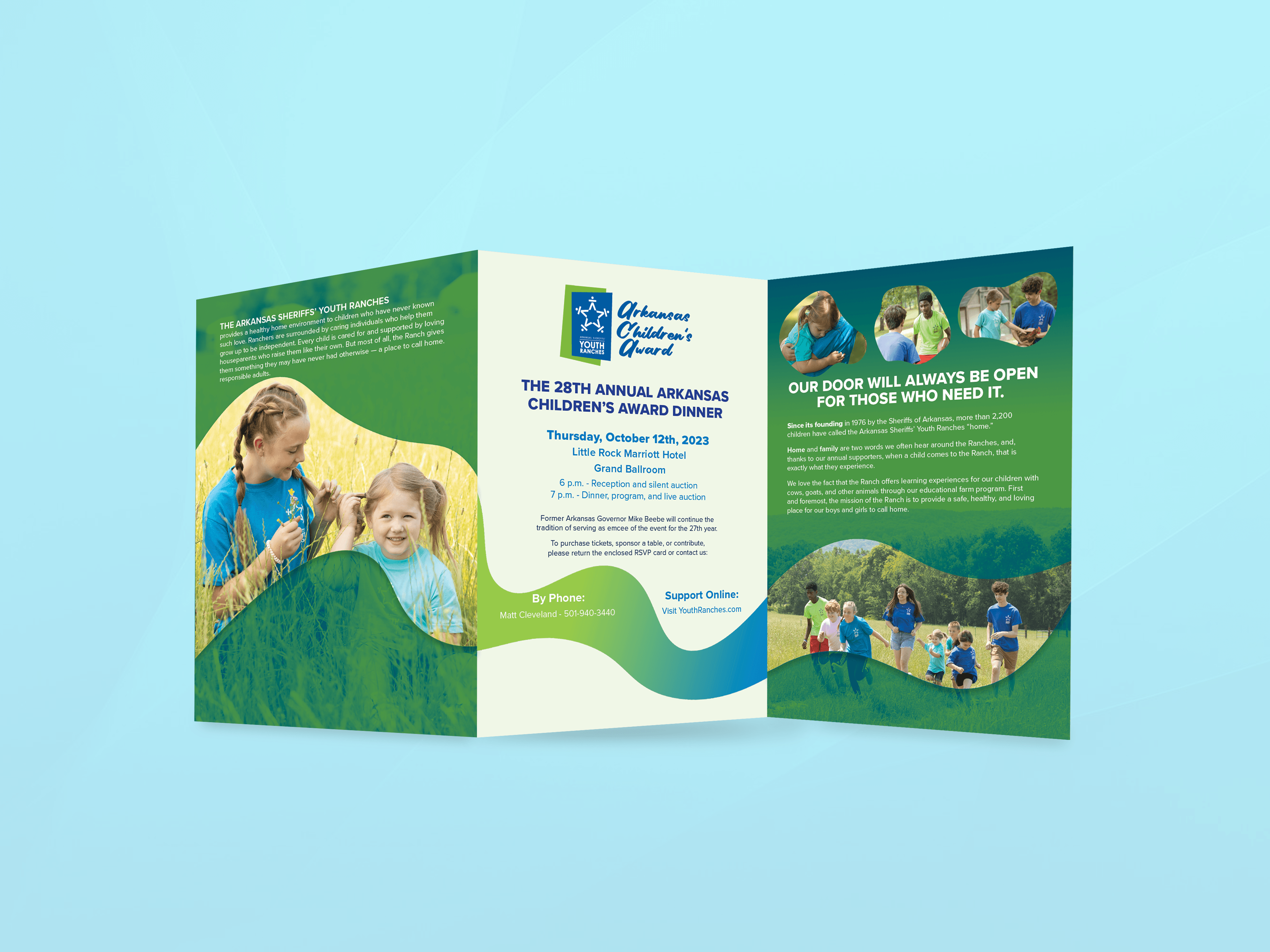
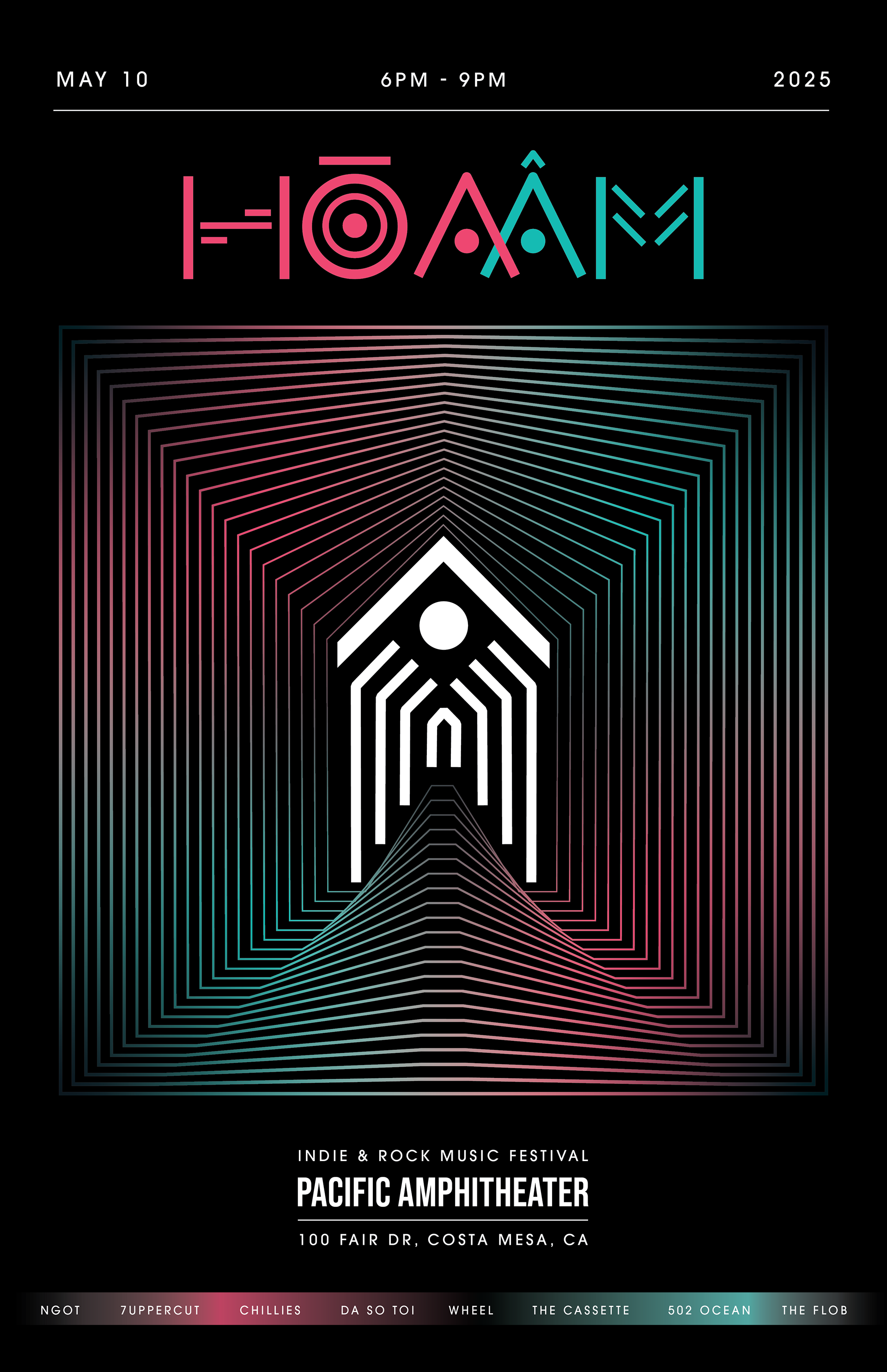
Hoa Am (hwaː˨˩ ʌm) - Harmony is an underground concert and Vietnamese EDM.
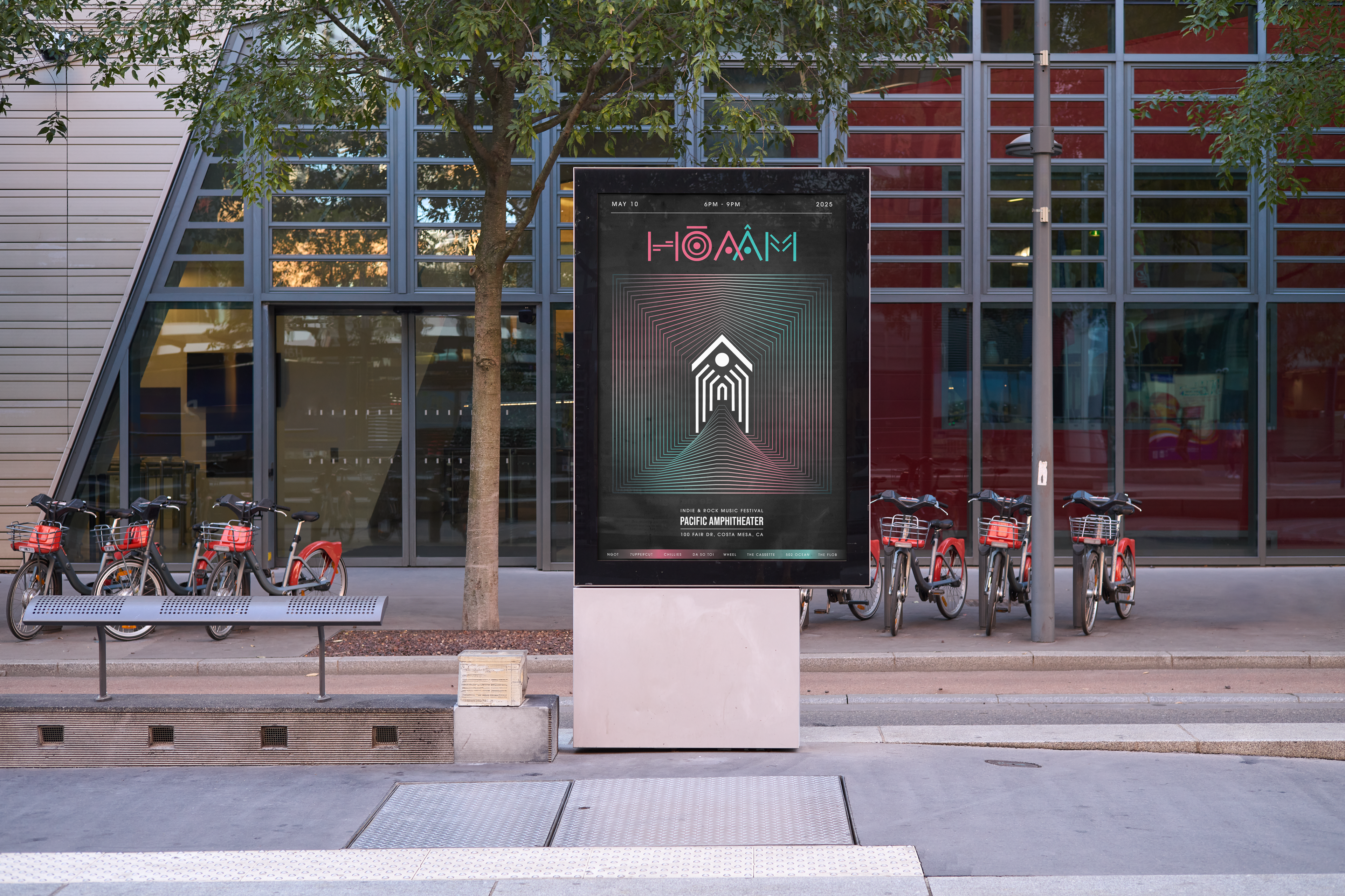
This concert has a combination of traditional elements such as patterns from the Van Lang period, along with the beautiful Vietnamese language - Hoa Am. The value of this concert will be to inspire people, expand new relationships, and spread traditional culture. It will create memorable memories for those who love Vietnamese culture and those who are new to discovering this beautiful country. Since this concert is underground music, this design wants to target audiences from 18-35 years old, very active age range. The venue is at Vung Tau front beach, a flat beach with a square where you can freely sway to the music.
Hòa (hwaː˨˩): immerse, mix.
Âm (ʌm): music, sound.
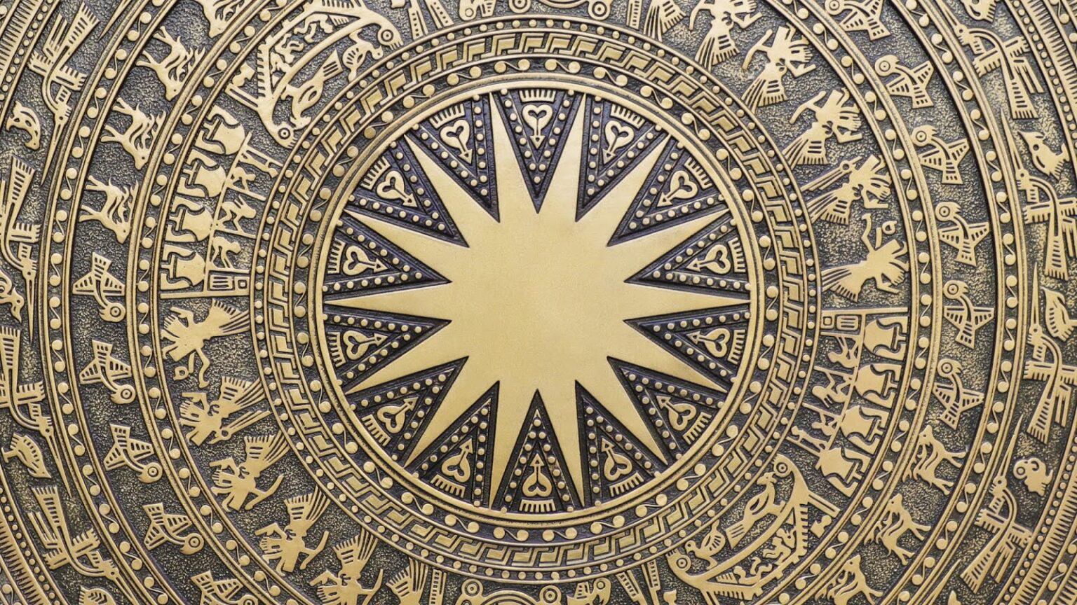
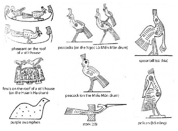
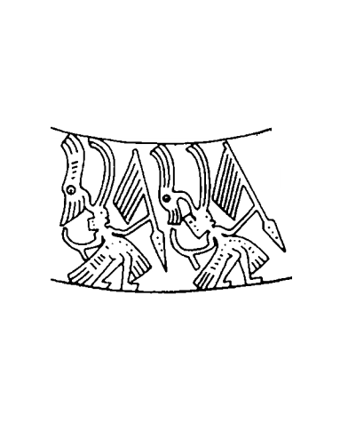
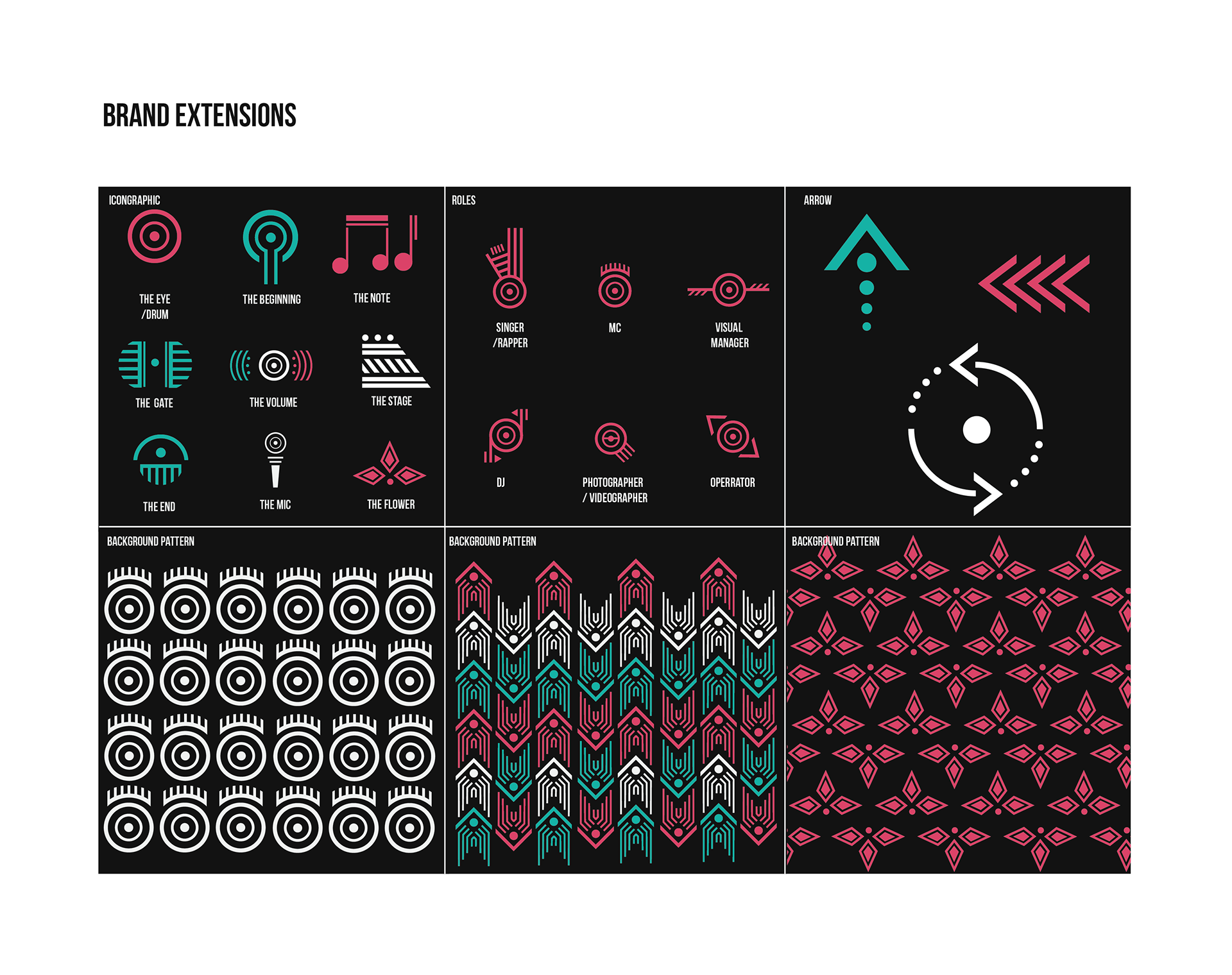
The meaning of this name is the wish that you can immerse yourself in the music and enjoy the moment fully and passionately. When I feel like incorporating traditional elements, I think the pattern of the Van Lang period is most appropriate, as it was the first state of Vietnam, to remind the participants that we used to have great aesthetics. I started studying the patterns on the Dong Son bronze drum. The Dong Son bronze drum originated from Vietnam, is a typical type of drum for Dong Son Culture (from the 7th century BC to the I-II century AD) and the Red River civilization of the ancient Vietnamese in the period. Hung Vuong founded the country of Van Lang. The bronze drum has become a sacred symbol of Vietnamese national culture. In addition, I have never seen an event that has a combination between culture traditional Vietnamese elements with Cyberpunk before, so I want to turn it into a colorful and vibrant concert. I will mix the traditional pattern with the cyberpunk effect to revise them into a modern vibe.
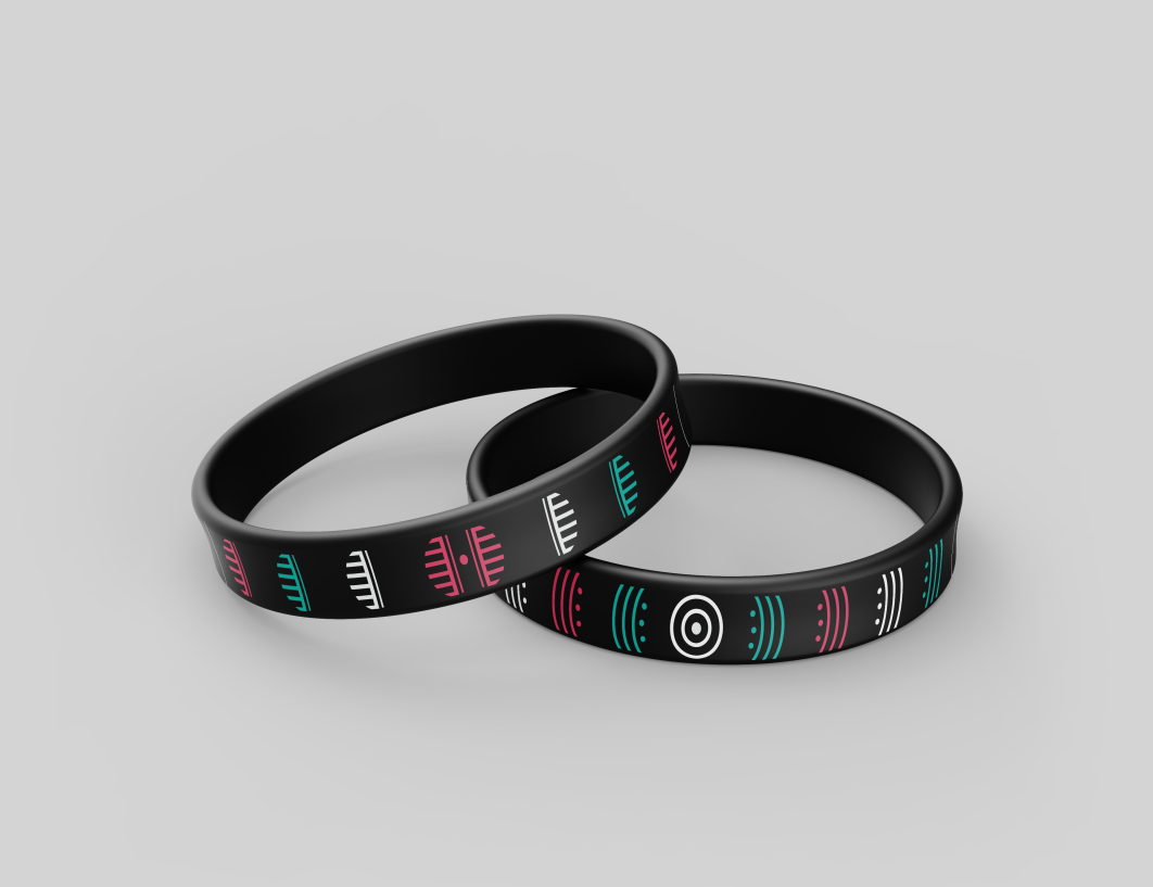
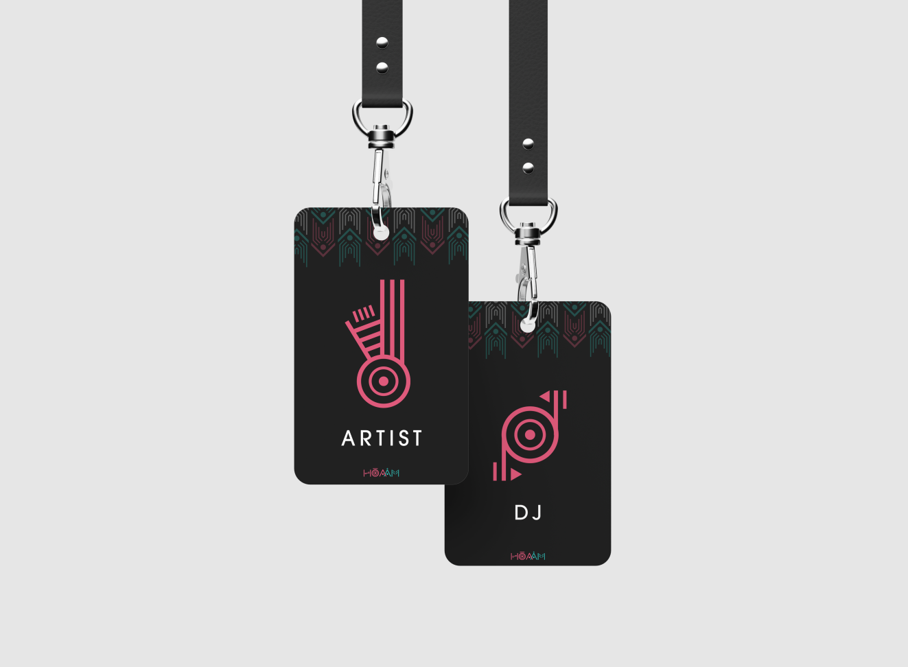
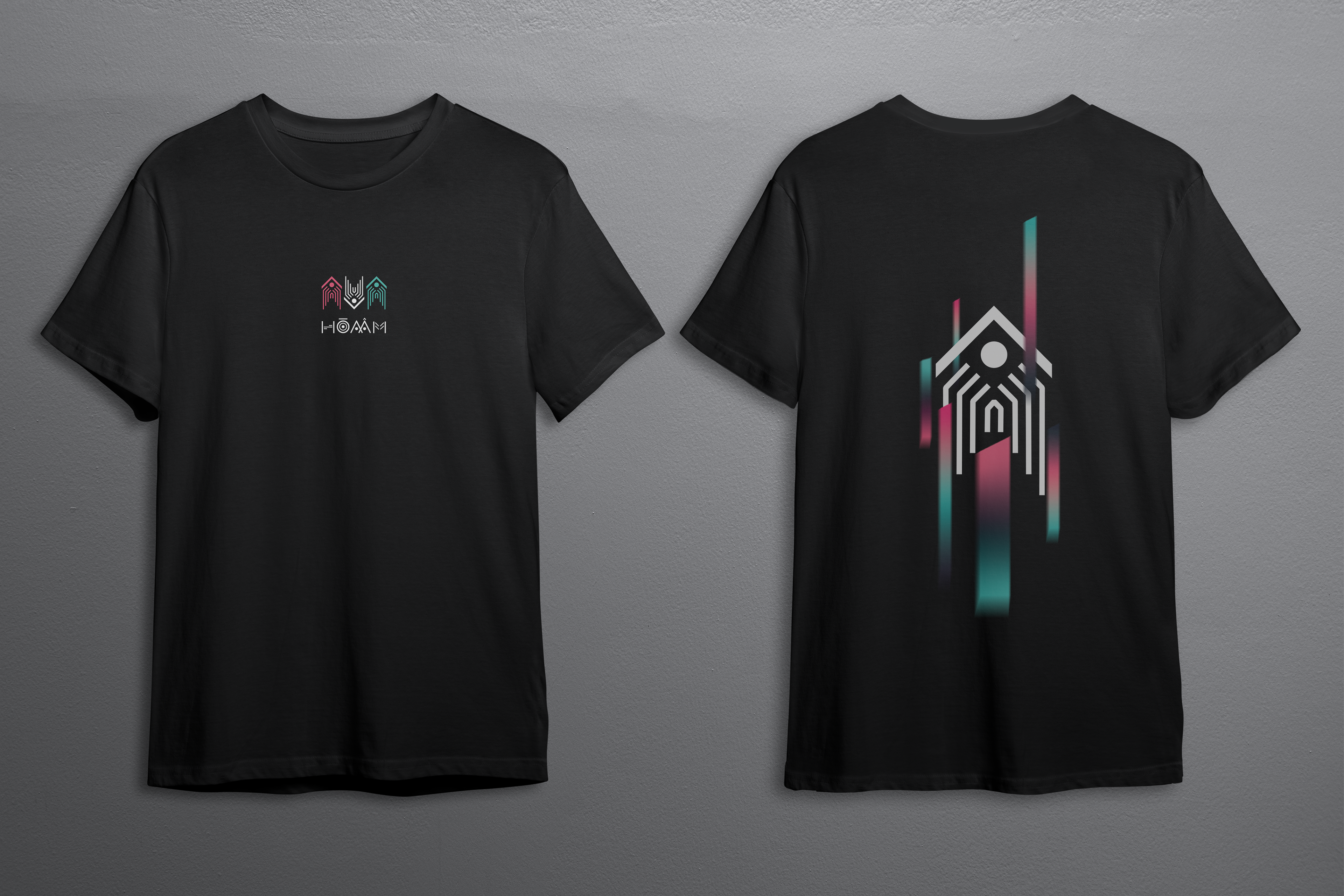
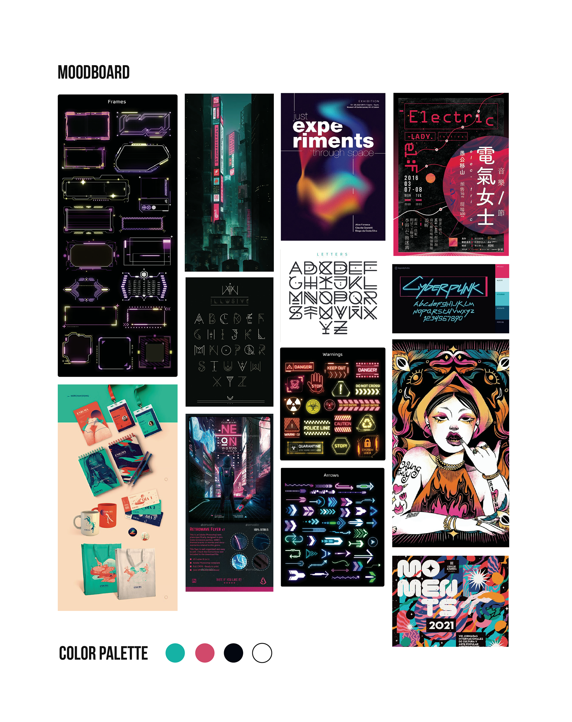
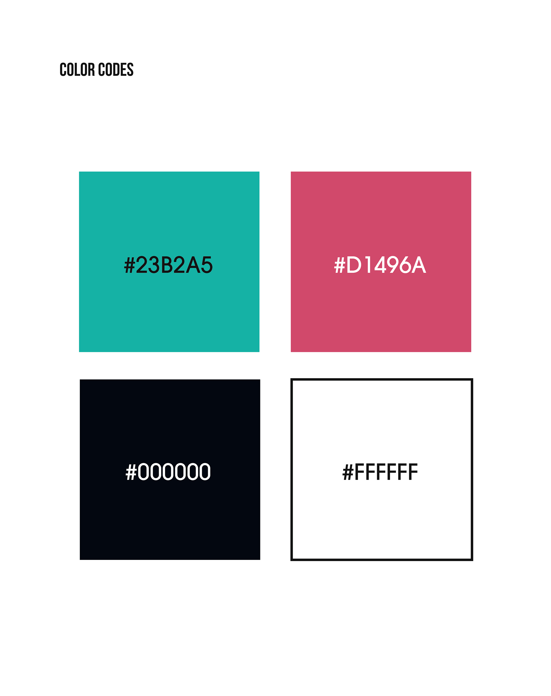
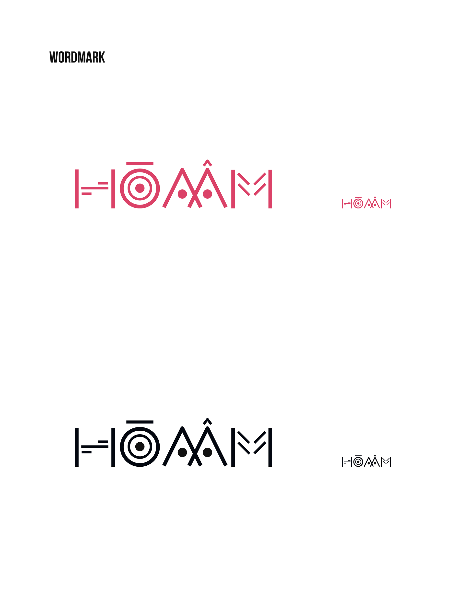
The colors I chose are neon light of the night city colors, giving it a futuristic vibe and the growth of technology. It used to be very complex with wide range of colors. However, too much color does not mean it will stand out. So I finally decided to choose turquoise blue and fiery rose pink. Both are complementary colors so the whole visual image will pop on dark background.
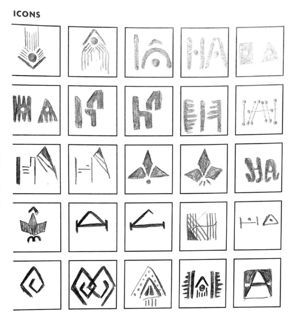
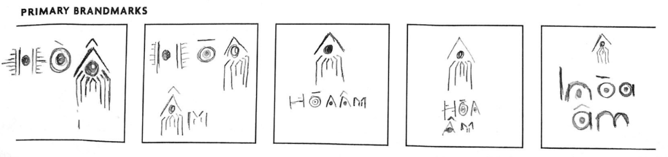
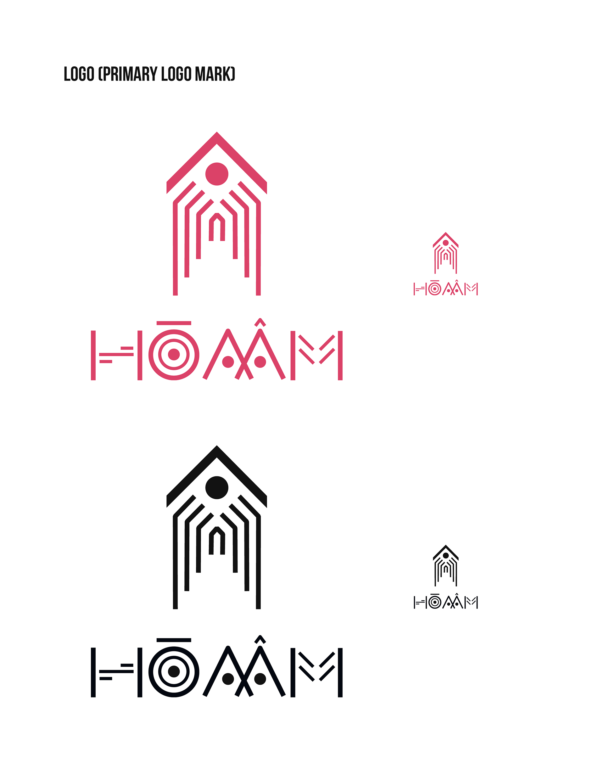
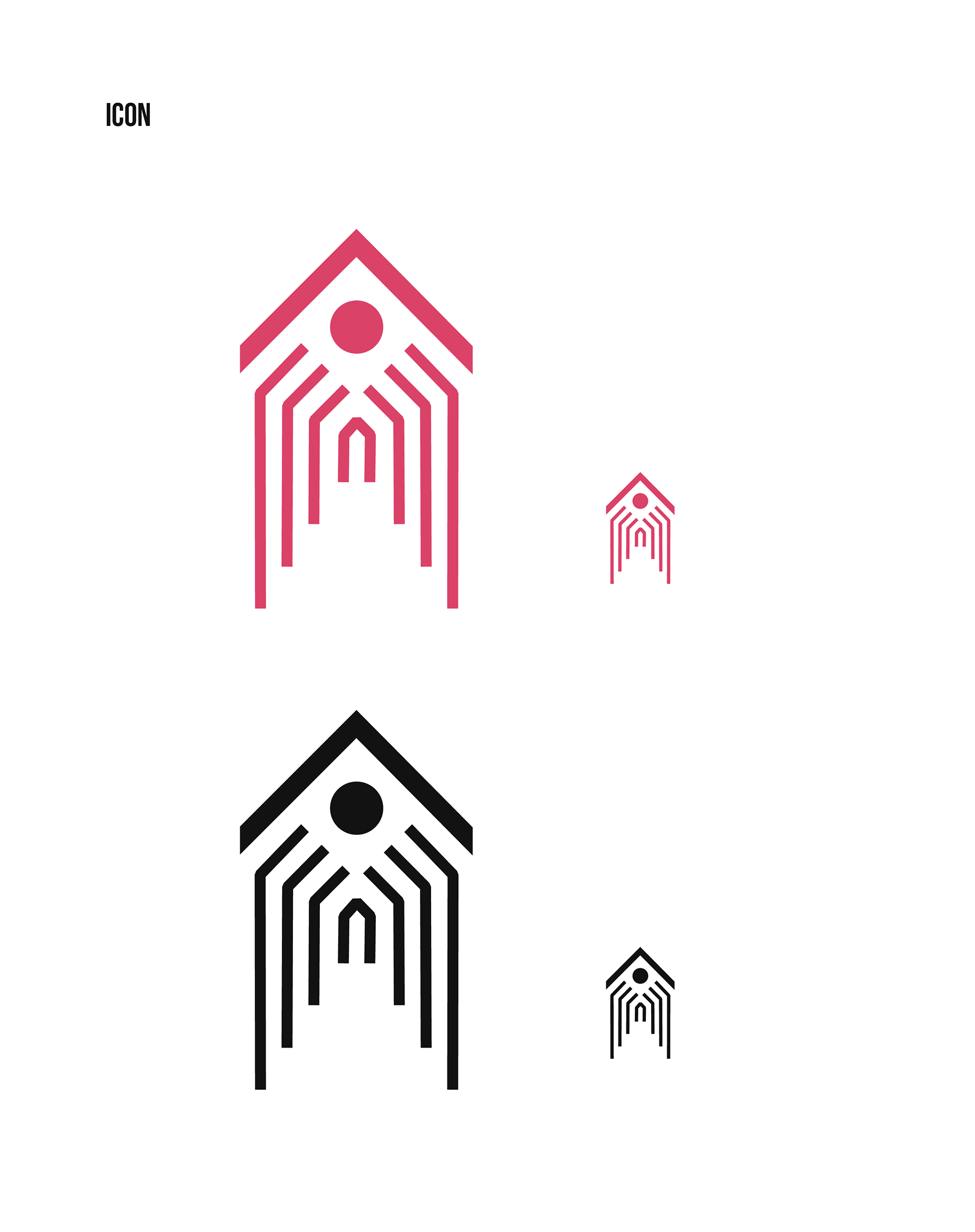
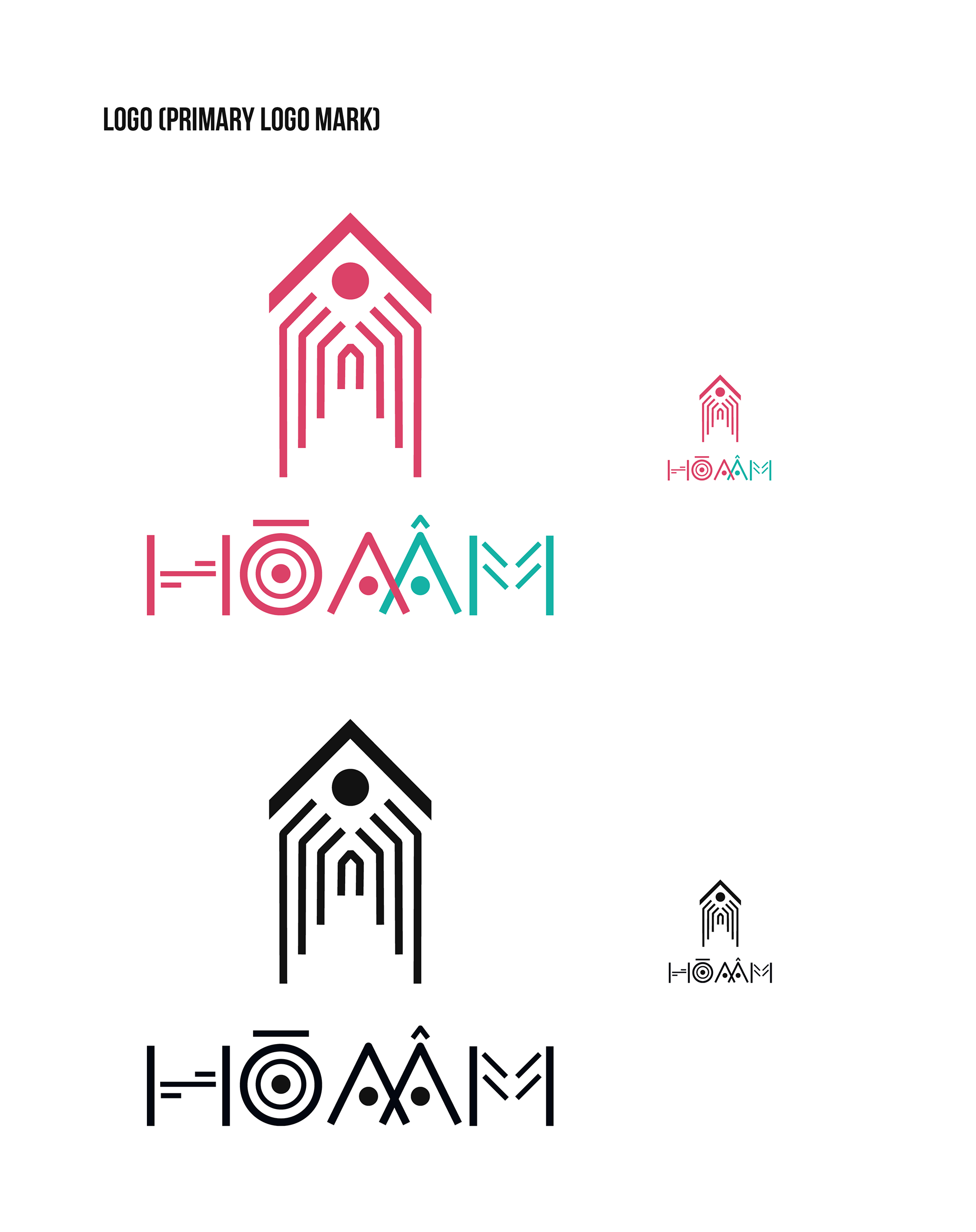
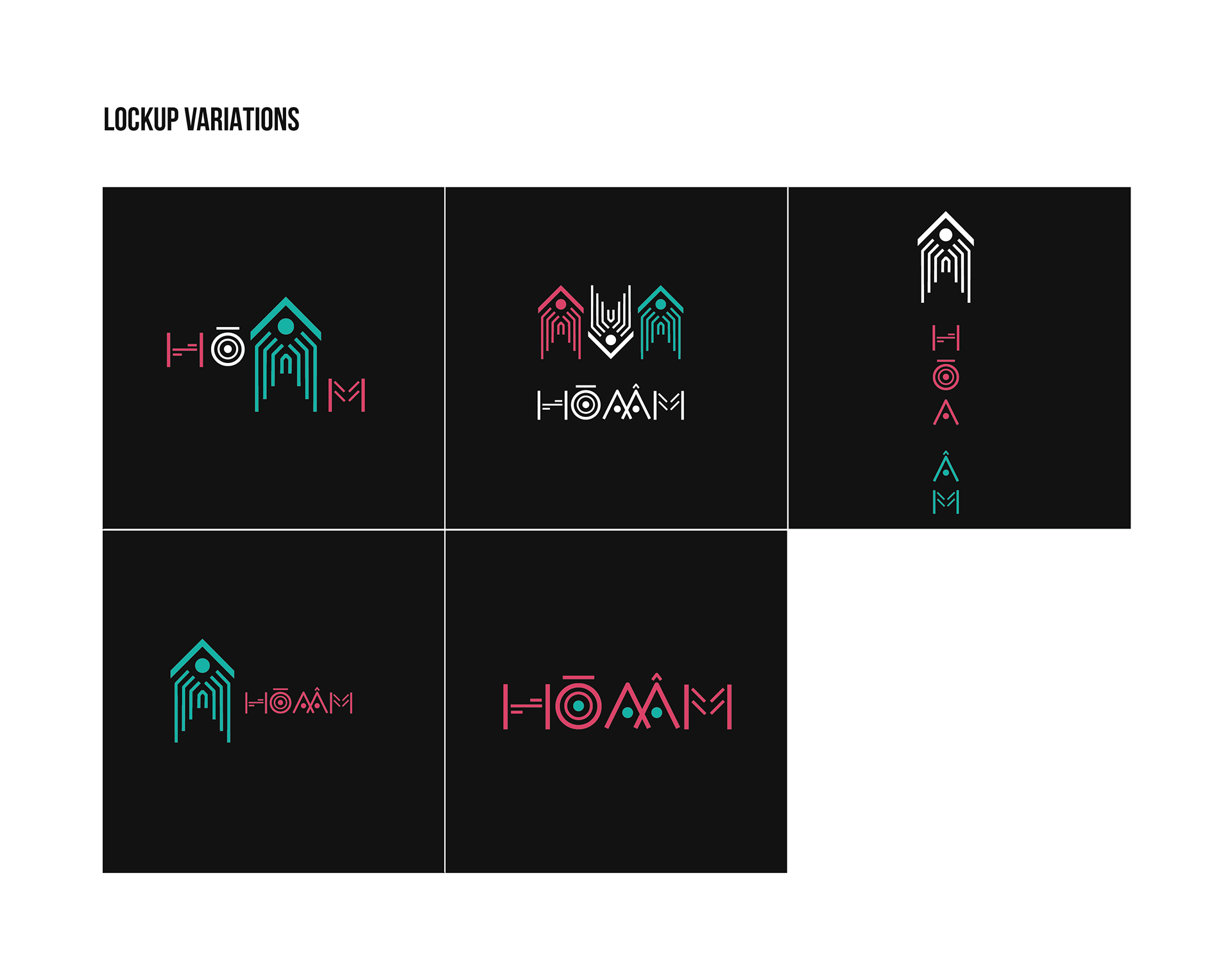
I looked at the details on the bronze drum and picked out the prominent features, often found in the pattern, and tweaked it a bit to make it different but still close. This is the key visual of the concert, and at the same time reminds young people of the old culture. After picking out the little details, I started putting them together to make something meaningful. For example, the circle represents the eyes and the drum. The triangle represents the roof. The straight line is like the microchip of a machine. From there I gradually developed other symbols. I also chose geometric and thin fonts so that it suits my design as well. In the end, I combine the elements together and show them in context, so the vision will be wider, I also edited a few things to make everything more harmonious.
SKETCHES
WIP I

WIP II
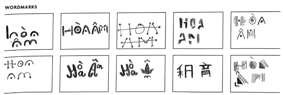
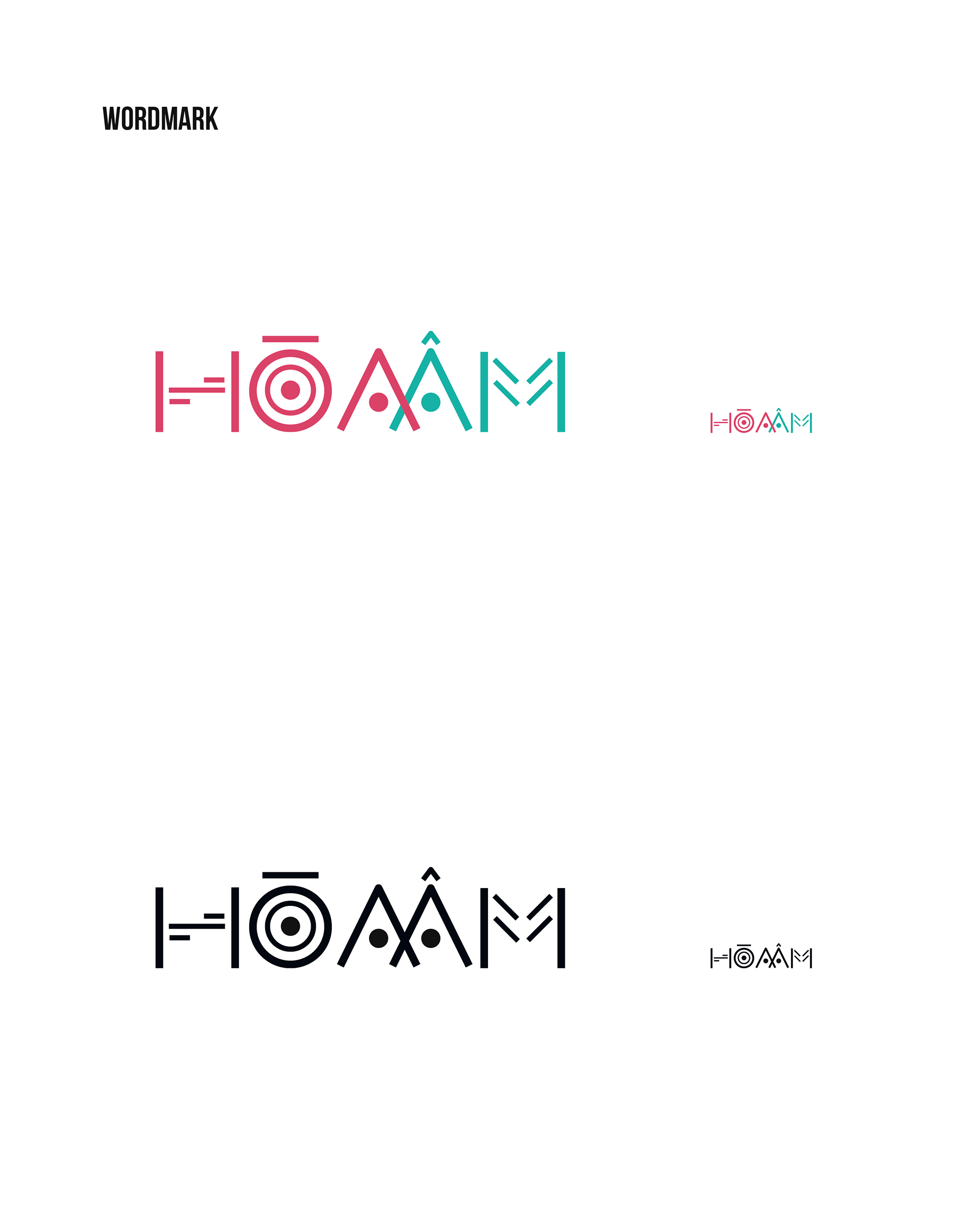
I got the feedback from my professor and peers that they could not read the word "Hoa Am" when they all were the same color. So, I turned the "Am" into turquoise and got positive reaction.
I think the biggest challenge is how to design both traditional elements suitable for modern music. I'm looking for a name that's easy to read and design easy-to-read, distinctive logos that are easy to remember. In the process of working, I was also quite pressured because I had to study culture, history, and design a lot of models in a short time. But I got over it, although the design is still not as great as I wanted (if I had more time I would do better).